The BlocklyProp Terminal is very useful in viewing the value of a variable as it changes while your program runs. Sometimes, however, it is easier to understand what is happening by graphing a changing value, instead of looking at just the numbers.
BlocklyProp has graph blocks for visually displaying values in a Graphing window. You can find them under the Communicate menu. Let's try it!
Graphing a Variable
This example project plots a straight line as the value of a variable increases with each trip through a counted loop.
- In BlocklyProp Solo, make a new project for your board.
- Build the project as shown below.
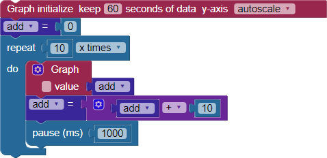
- In the Graph initialize block, set the time (x-axis) to 60 seconds, and leave the y-axis at autoscale.
- Save the project, and click the Run once button.
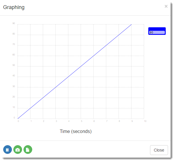
You should see the graph generate for 10 seconds until it looks like the one below. The horizontal x-axis of the graph is the time in seconds, and the vertical y-axis is the value of the add variable.
How it works
The very first block is Graph initialize. The keep 60 seconds setting generated the vertical grid lines as shown above. The y-axis autoscale setting let the graph size itself to fit the data vertically.
Next is a set variable block that initializes add to zero. The add variable gives us a value for the project to plot.
The rest of the code is in a loop set up to repeat 10 times. The Graph value block is the first thing inside the loop, with the add variable attached. Since add was initialized to zero and hasn't changed yet, the plotted line begins at the origin 0,0. Next, the set variable block with an addition operation attached increases the value of add by 10. A pause (1000) block slows the loop down so the graph updates approximately once per second.
Each time through the loop, add increases by 10, plotting a new point that is one division up and to the right, creating an upward-trending straight line. It stops at 9 on the x-axis, because the loop began counting at zero. And it stops at 90 on the y-axis for the same reason. Notice in the upper right corner of the Graphing window, there is a little box matching the color of the plot line, displaying the value 90. That is the value of add when the loops are complete.
Did you Know?
Save, Refresh, Run! — Each time you change your project code, click Save. Then, you will need to refresh your browser before you run your updated code - every time. Otherwise, you will see your data label values update, but you will not see any traces plot onto the graph.
Graph or Terminal, pick one! — Do not try to use Graph and Terminal blocks in the same project, just one or the other. Even if your Graph initialize block is at the top of your code, and a Terminal print text block is at the very bottom, the Terminal takes charge and will prevent the Graphing window from opening. You would, however, see some data values appear in the Terminal window.
Try This
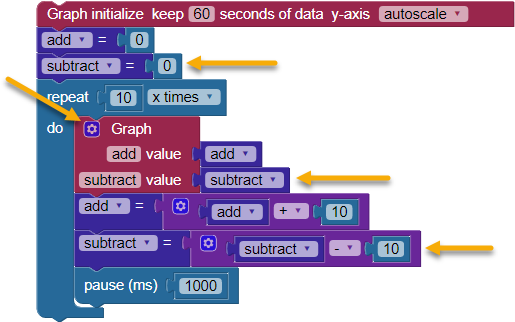
Let's graph the value of a second variable, named subtract, along with the first one.
- Create a variable named subtract, and initialize it to zero.
- Click the gear on the Graph value block, and drag another value underneath the first.
- Label each value with the name of the variable it will display, add and subtract.
- Attach the Use variable subtract block to its labeled place on the Graph value block.
- Add blocks to decrease the subtract variable's value by 10 each time through the loop.
- SAVE YOUR CODE!
- Refresh your browser!
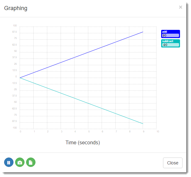
- Run the updated code. Your graph should now show two traces, one trending upwards and one trending downwards. Also, each variable name and its value are in the upper right corner, in a box color-matched to its plot.
Your Turn
Your project can graph up to 10 values at the same time!
- Add a third variable named multiply, initialized to 1, and multiply it by 10 each time through the loop.
- Save your code and refresh the browser, then run the updated project. Did it plot three lines this time?
- Keep adding more variables, along with code to modify them each time through the loop with the math operation of your choice, and graph their values until your project displays 10 plots.